
Two Sydney clinics under two different names, brought together as one brand and one website, built on why they do what they do.

Studio optics

Sector
Health, optometry
Where
Western Sydney, NSW
We made
Brand, website, print
Platform
WordPress
Clinics
Guildford West, Ed Square
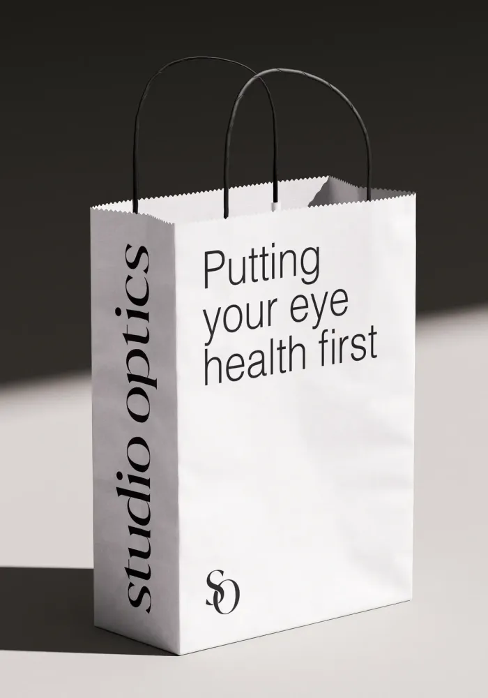
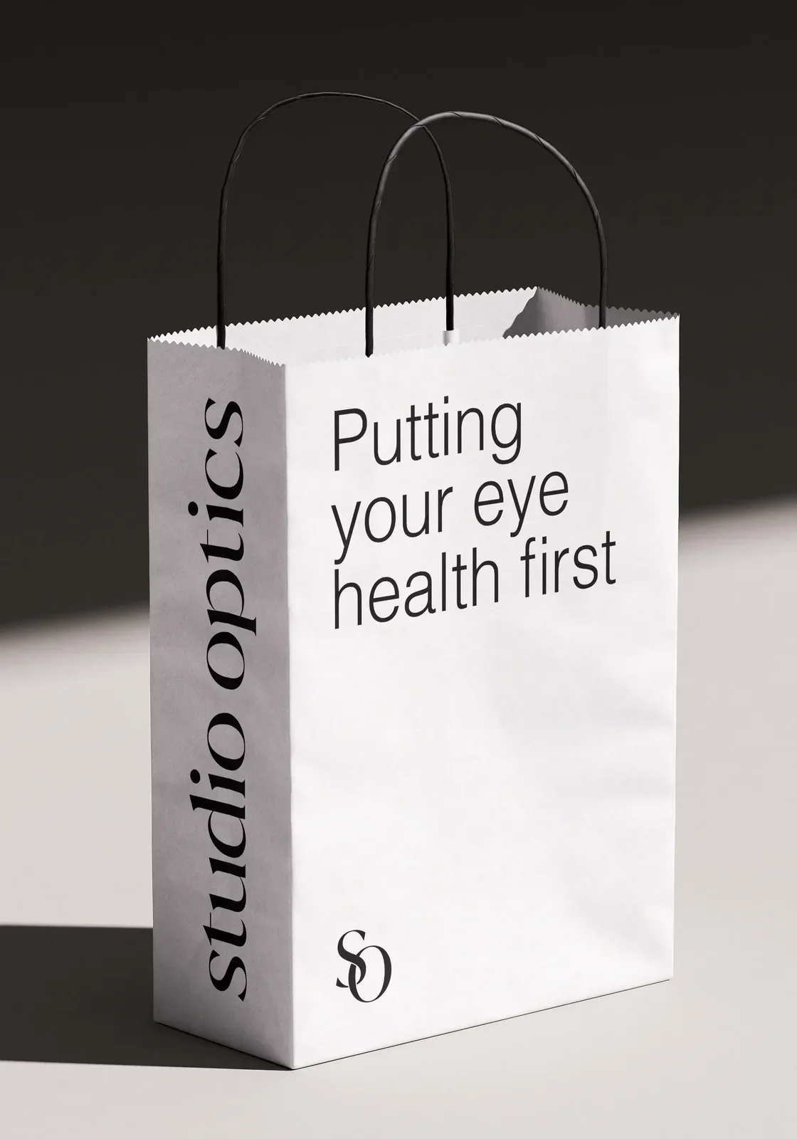
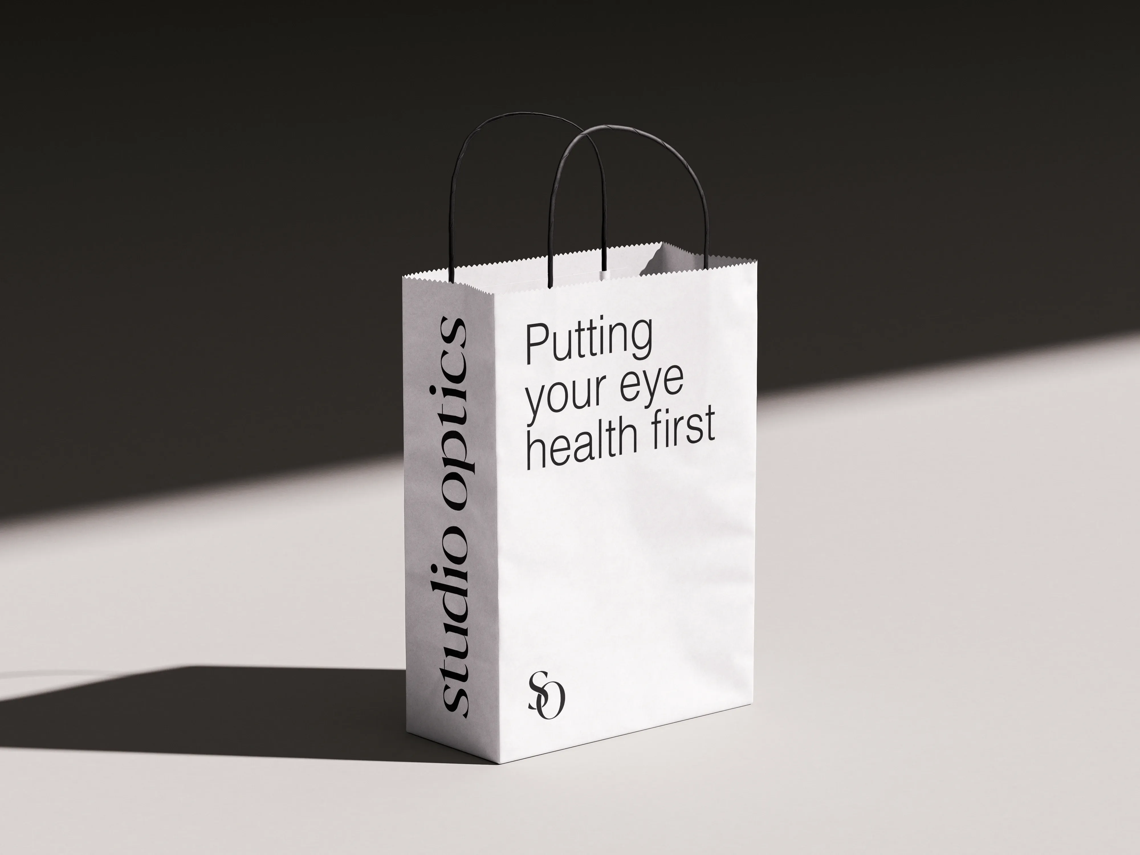
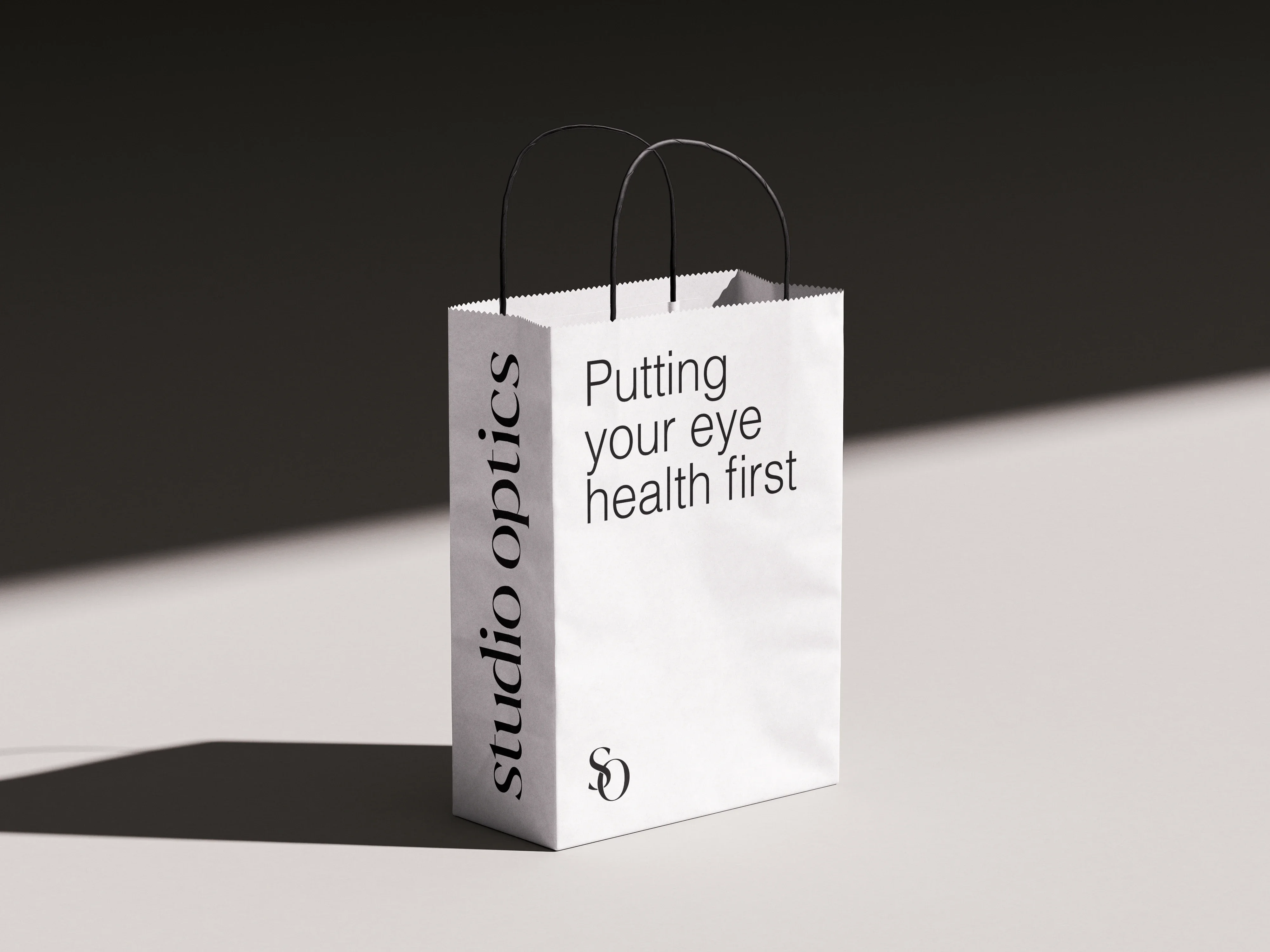
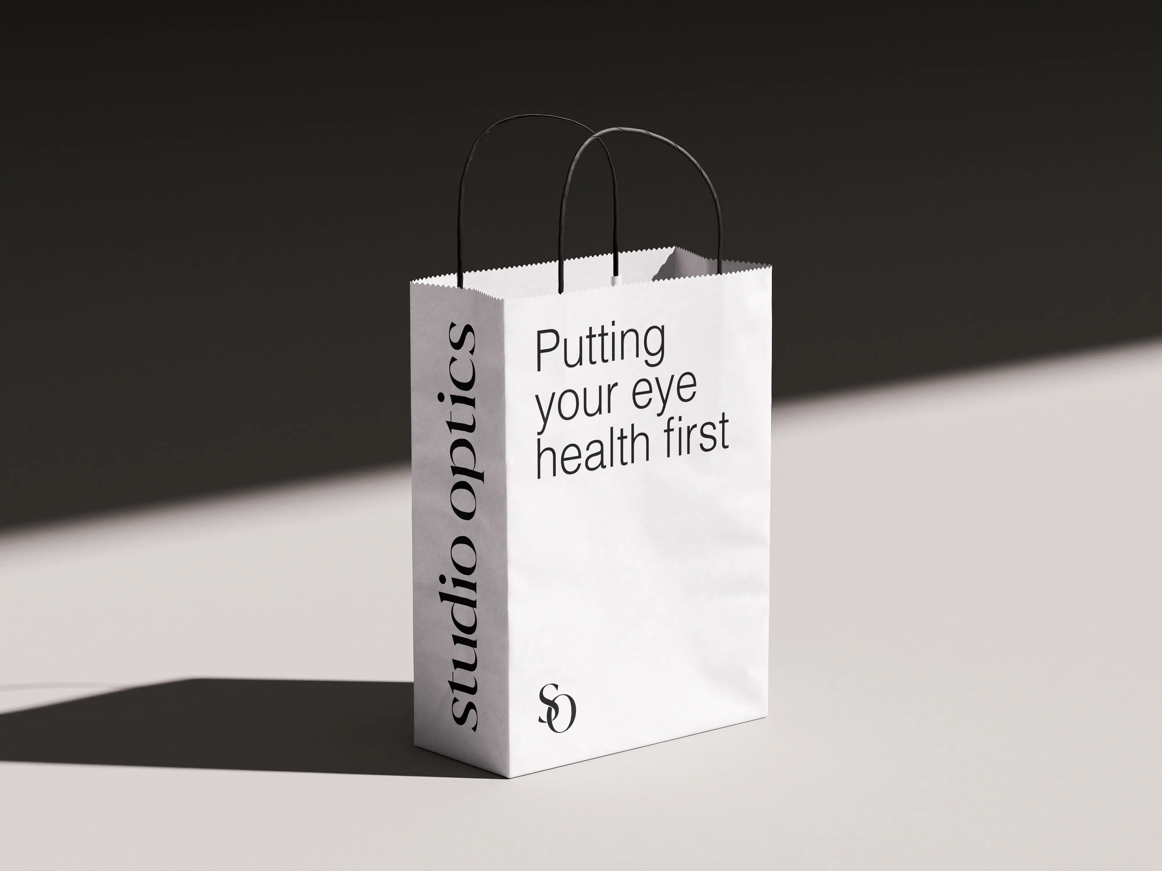
A Studio Optics paper shopping bag in bone, putting your eye health first, standing in light and shadow

The brief

Studio Optics is two optometry clinics in Sydney’s west, giving honest, patient-centred eye care to every age and every budget.

The clinics had grown up under two different names, with nothing to tie them together. The job: one brand and one website, built on why they do it .

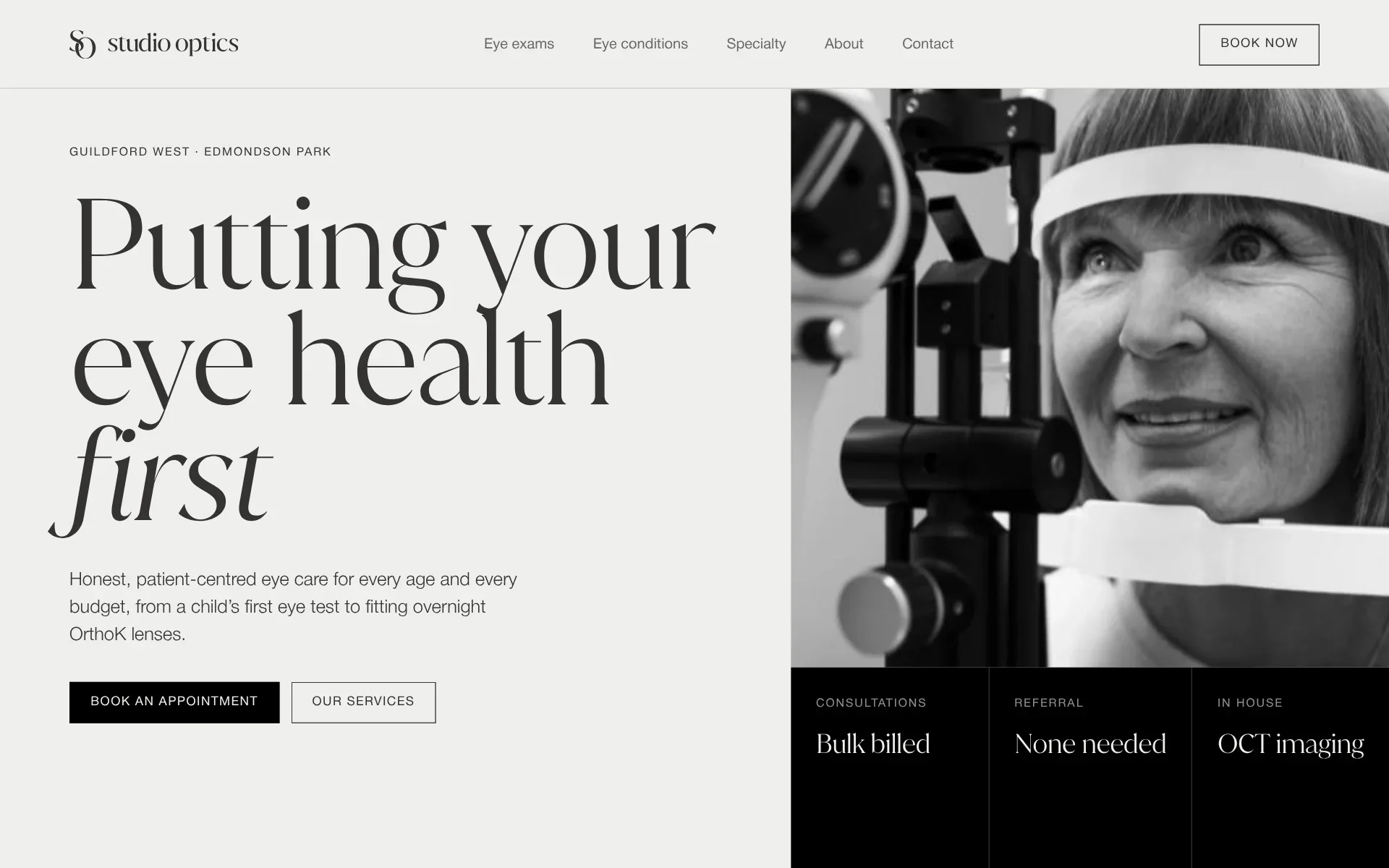
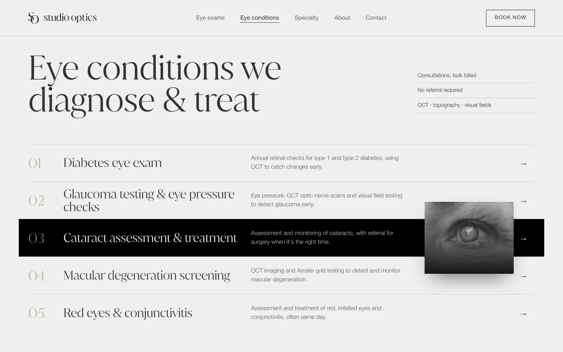
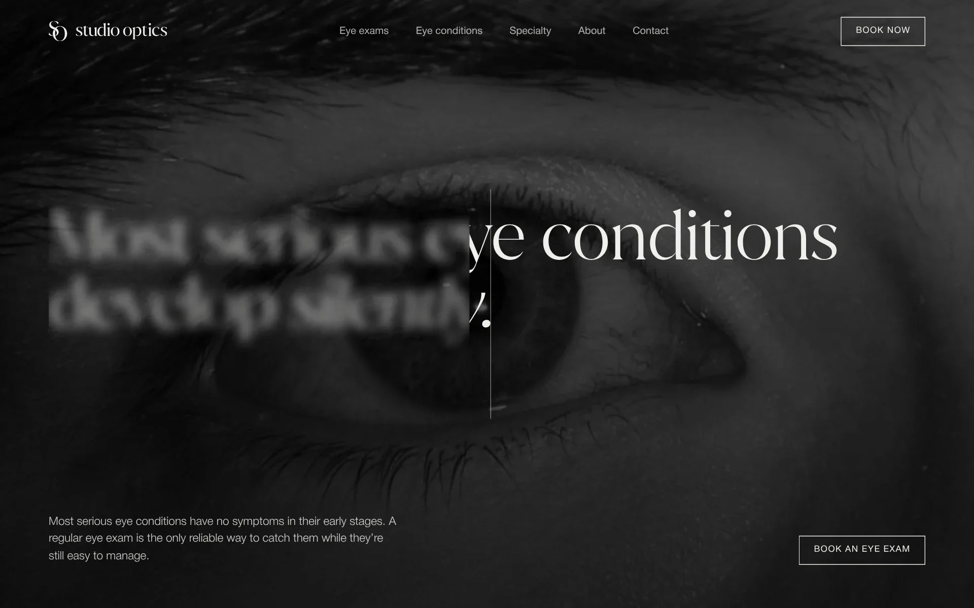
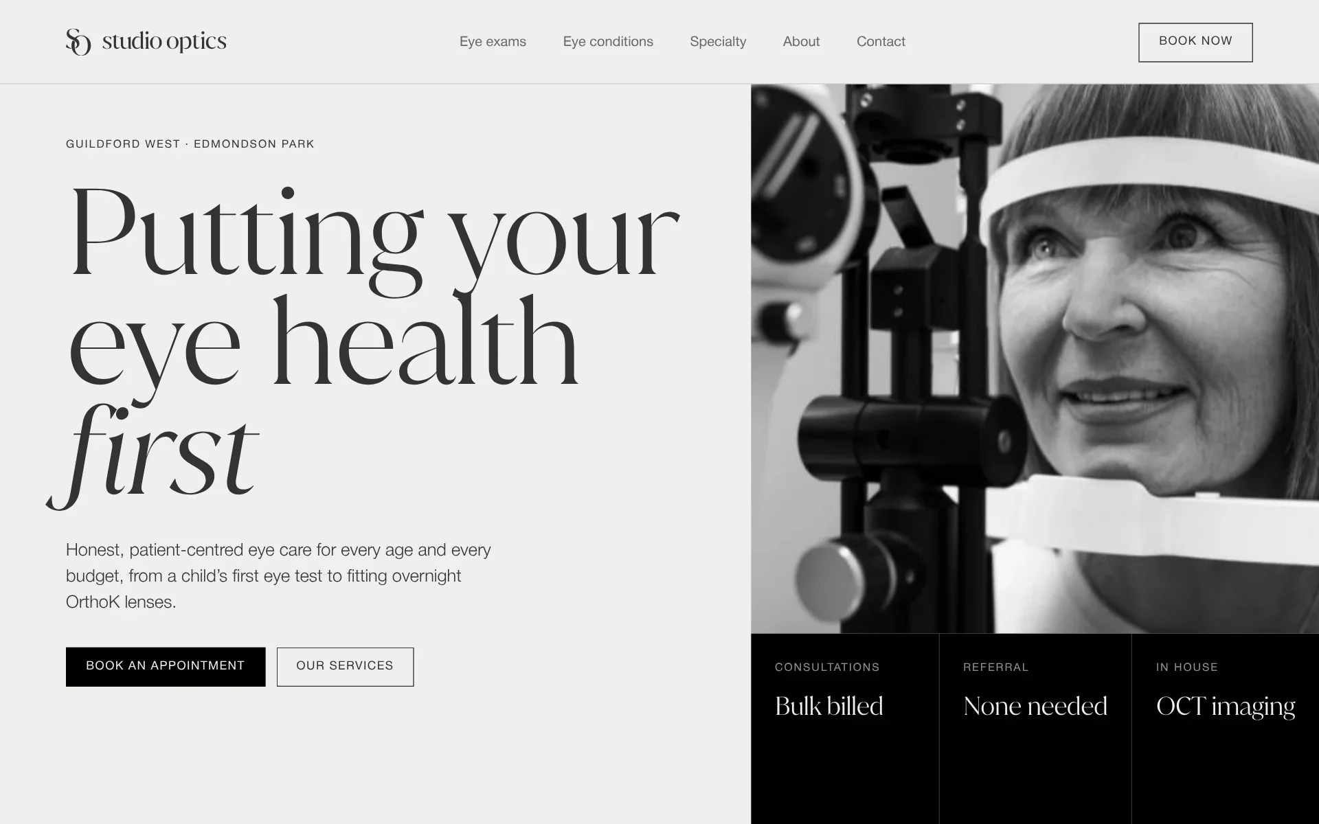
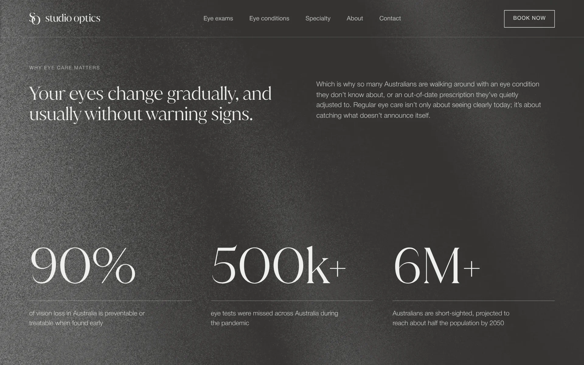
The website on desktop

  • The home page: putting your eye health first
  • Why eye care matters: 90%, 500k+ and 6M+, on onyx
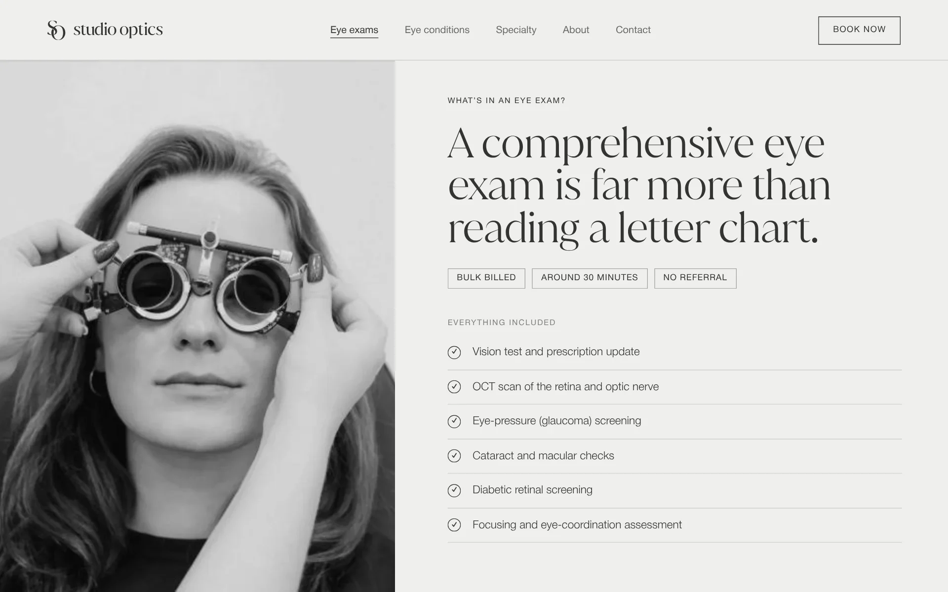
  • What’s in an eye exam: everything included, a row each, beside a trial frame
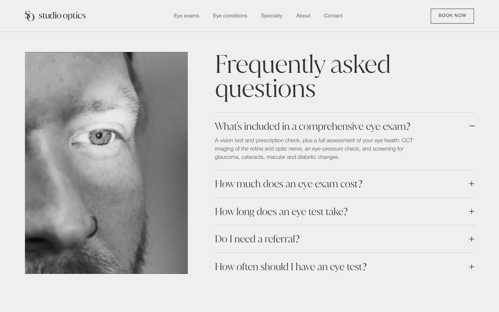
  • Frequently asked questions, one open
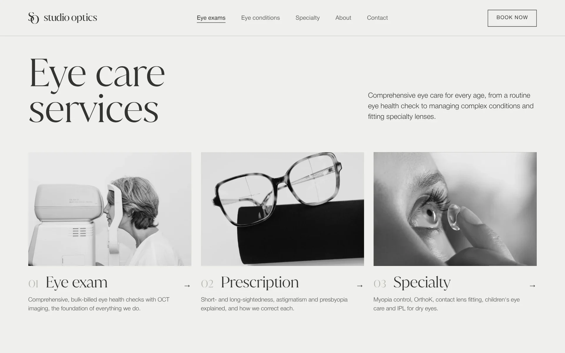
  • Eye care services: eye exam, prescription and specialty, a card each
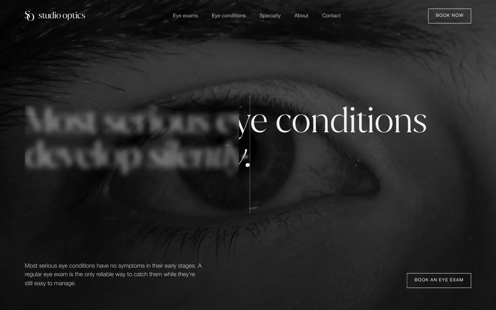
  • Most serious eye conditions develop silently, half out of focus
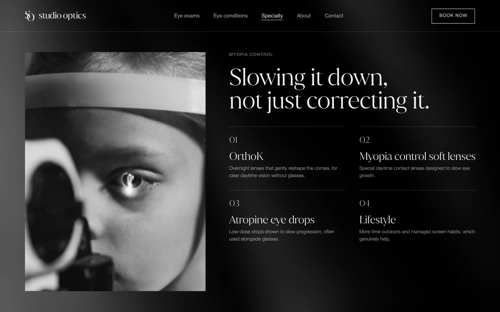
  • Myopia control: slowing it down, not just correcting it, four ways
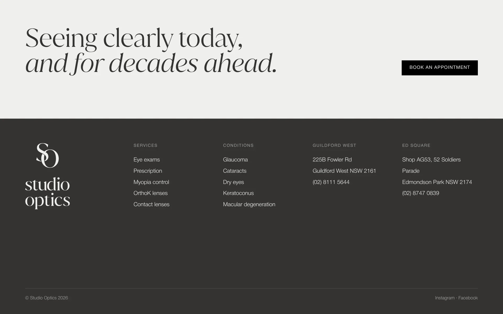
  • The foot: seeing clearly today, and for decades ahead, the lockup and both clinics
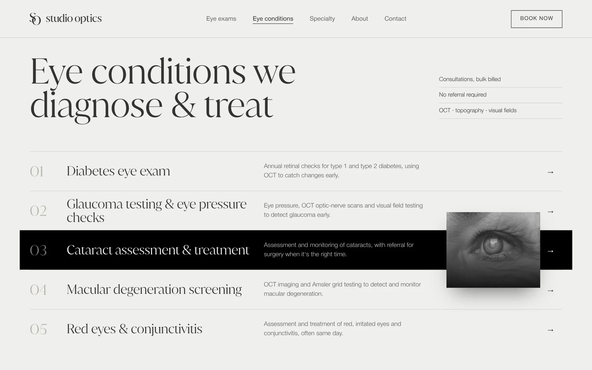
  • Eye conditions we diagnose and treat, numbered rows
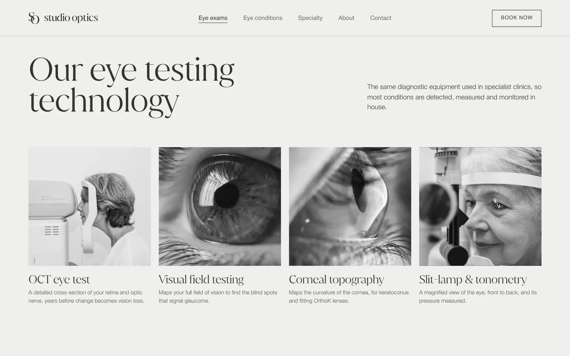
  • Our eye testing technology: four instruments, a photograph each
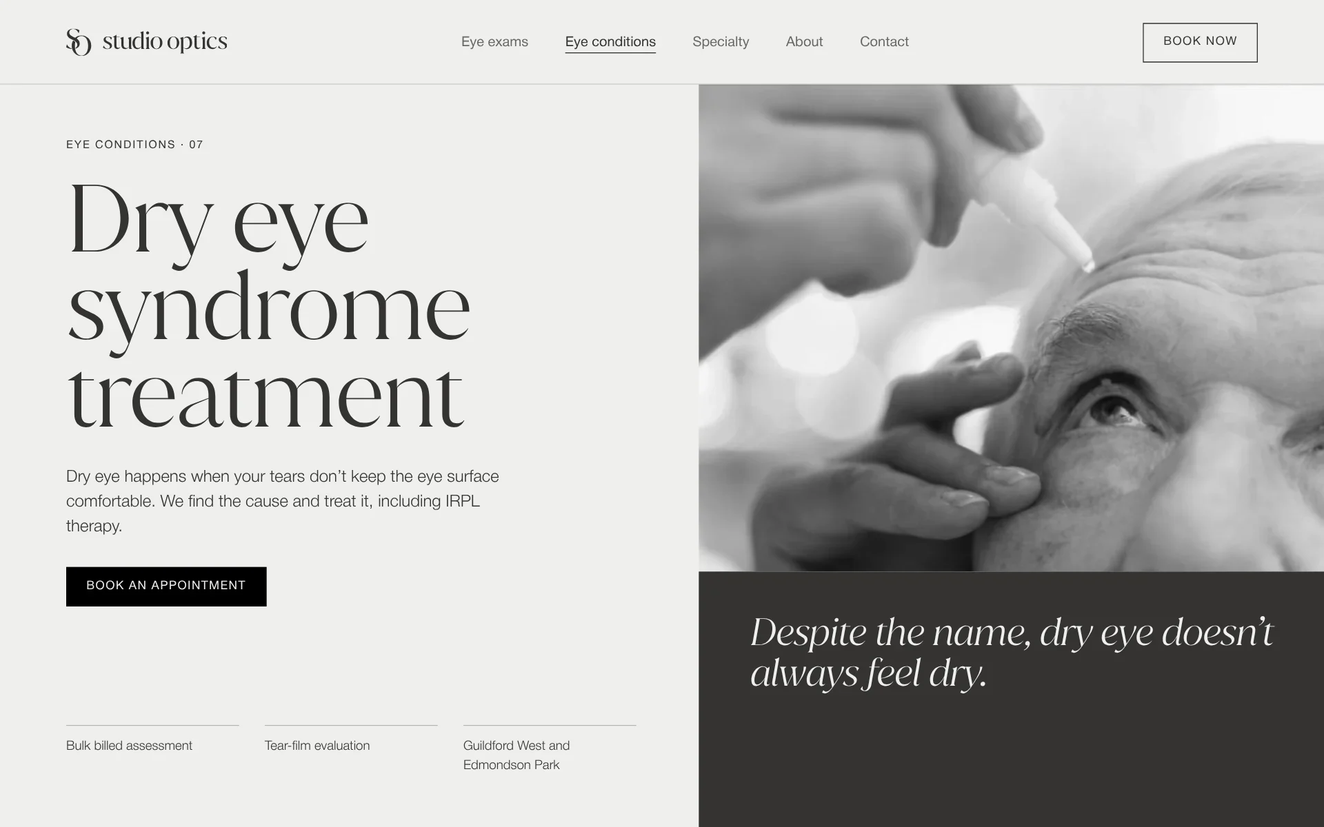
  • Dry eye syndrome treatment: despite the name, dry eye doesn’t always feel dry
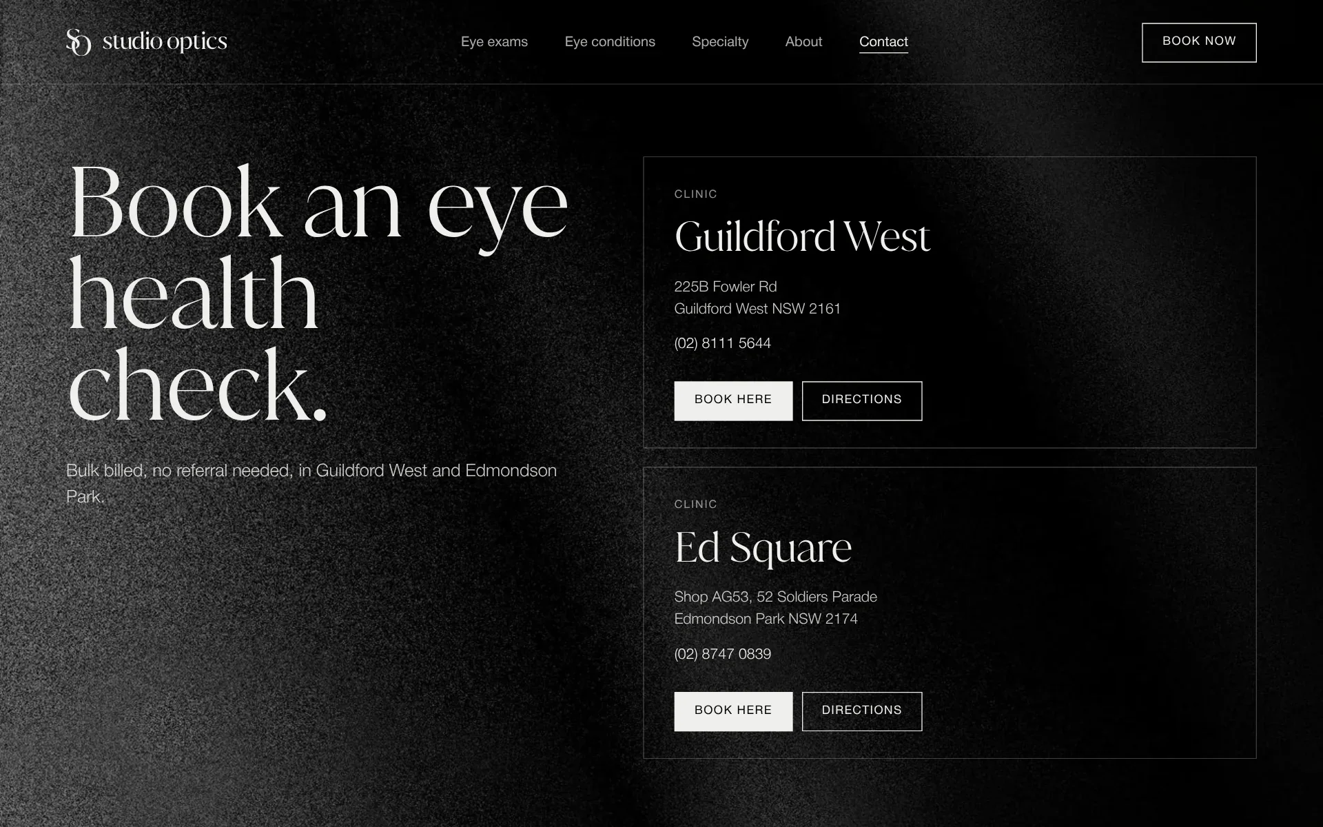
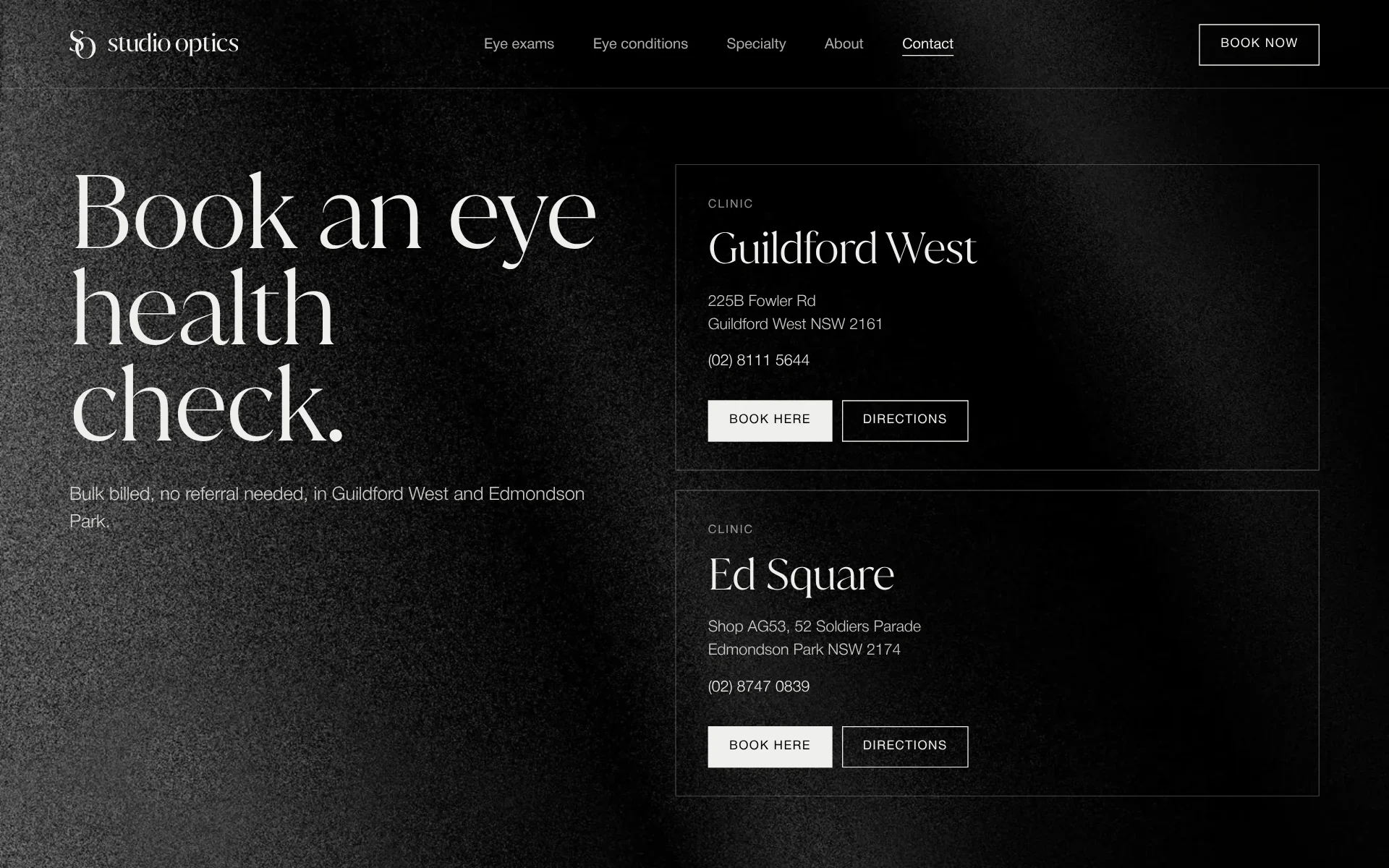
  • Book an eye health check, both clinics on black

What we made

We started from why they do what they do, then made one brand for both clinics, a website that explains eye care plainly, and what goes out the door with every pair.

Strategy

Sessions with John found the foundation the rebrand stands on: a mission of honest, patient-centred care for every age and every budget, a vision of a community where everyone feels genuinely cared for, and the words they want to be known by. From them came a framework for the site, built around one thing: getting from a worry to a booked eye test.

We made

  • Brand strategy
  • Mission & vision
  • Brand keywords
  • Website framework

Identity

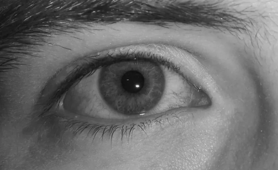
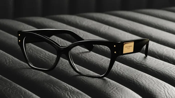
Quiet and assured, like a good boutique: an S and an O drawn as one for the monogram, a wordmark in Juana, a monochrome of bone, onyx and black, Juana for the lines that carry a page and Helvetica for the rest, and black and white photography in a dark and light visual system.

We made

  • Logo
  • Colour system
  • Typography
  • Visual system
  • Brand guidelines

Website

Designed on the brand’s system and built on WordPress: every service and every condition a page of its own, written plainly and titled for the searches people make near their clinics. The care is explained before it is sold, and an appointment at either clinic is a tap away from any page.

We made

  • UI design
  • WordPress website
  • SEO
  • Copywriting

Digital

On their feed, the same quiet: Juana lines on bone, onyx and black, their photographs in black and white, the monogram in the corner. And motion that shows a condition from the inside, the type blurring, doubling and clouding before it clicks back into focus.

We made

  • Social media
  • Post templates
  • Motion

Print

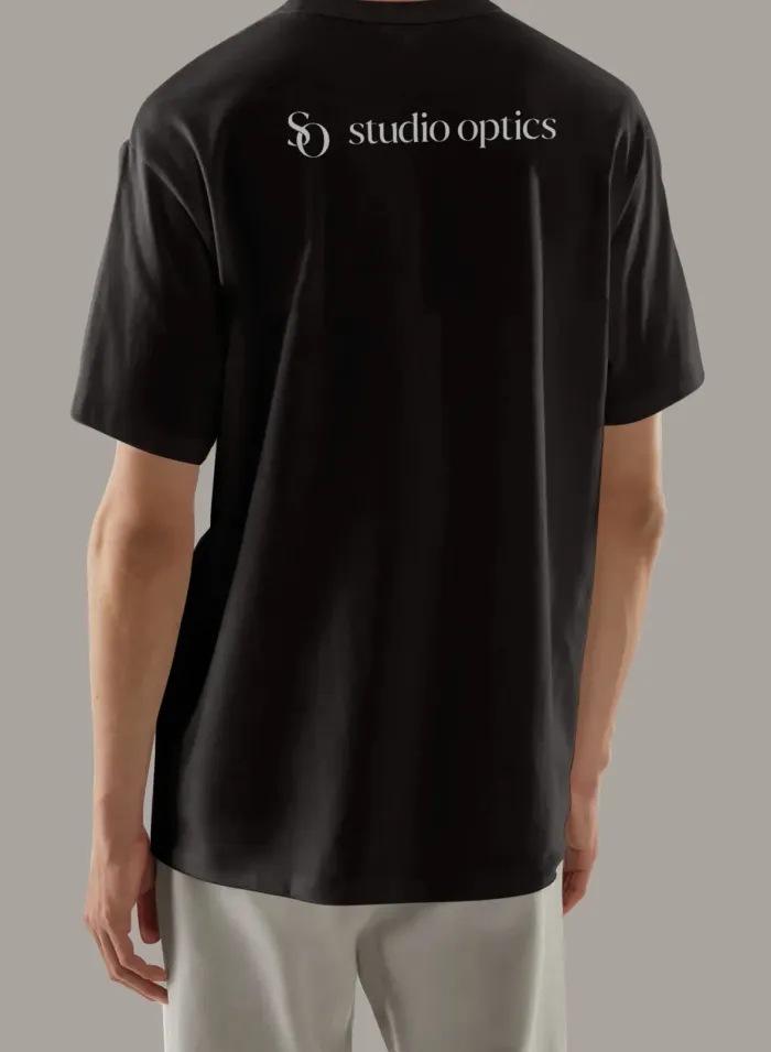
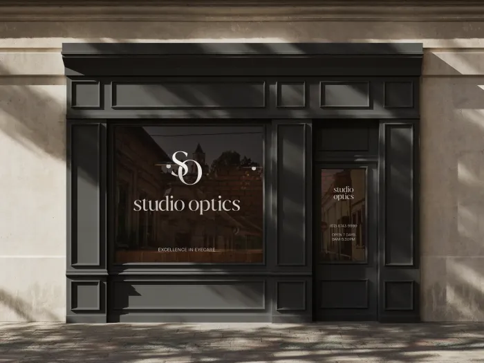
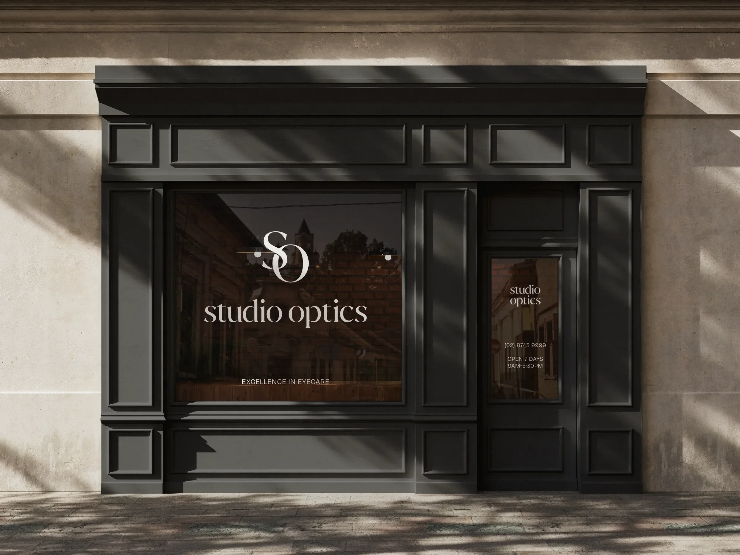
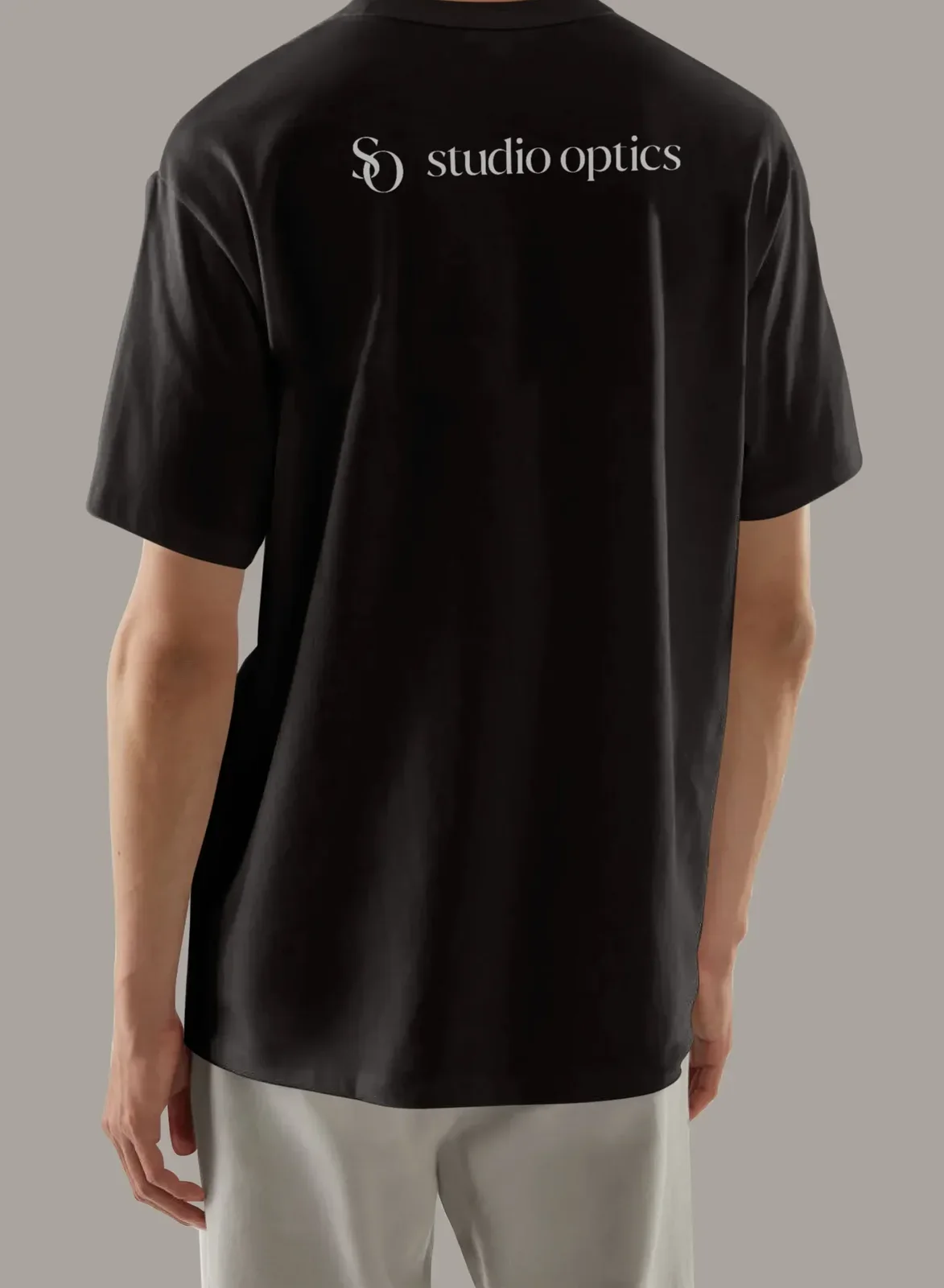
Off the screen: the shopfront’s window, the paper bag every pair goes home in, and the tees the team wear behind the counter.

We made

  • Signage
  • Shopping bags
  • Uniforms

What changed

The work in numbers, and in John's own words.

clinics under one name for the first time
2
pages designed and written for the new site
40
pages of brand guidelines, strategy to visual system
17

In the past, the designers I worked with focused purely on the visuals. Judy was extremely easy to work with, and actually took the time to help us build a strong foundation for our rebrand, one that strengthened our why.

John, Founder, Studio Optics

Next case study

Saigon bites